Environmental Design Class Visits Tsoi Kobus Architects to Learn About Wayfinding


Graphic design is not limited to print and web; graphic design skills are needed in areas such as environmental design as well. NESAD’s Environmental Design course is a multidisciplinary class that combines students from the graphic design program with interior design students. Recently, they visited Tsoi Kobus Architects, a Cambridge based architecture and interior design firm, to learn more about wayfinding.
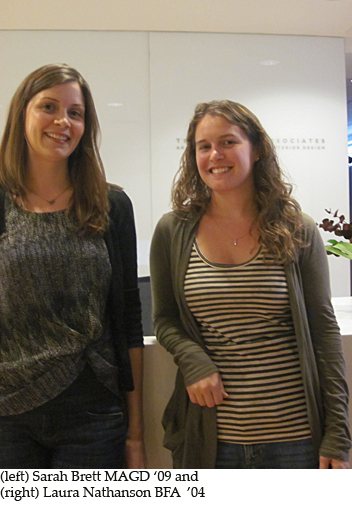
Wayfinding is a system designed to aid individuals’ navigation through a physical space. Two employees and former NESAD students from Tsoi Kobus Architects, BFA graduate Laura Nathanson and MA graduate Sarah Brett, presented a wayfinding project they have been working on for Massachusetts Eye and Ear Infirmary. They explained the process of wayfinding: research, evaluation, planning, and final production.

Part of their research included visiting the Perkins School for the Blind where a recently installed wayfinding system that does not rely on sight was installed. Students were able to put on goggles that imitated various sight impairment situations.

Grace Murthy, a graduate student in the Environmental Design class says, “What I found interesting at Tsoi/Kobus was their creative way that they were able to incorporate wayfinding considering the city’s restriction. In their wayfinding solutions, they were constantly thinking about the decision points that the viewer makes. Their solutions needed to function as directions but also needed to incorporate the esthetics of the building’s architecture.”

Darren Breault, Class of 2002, Working at Extreme Makeover: Home Edition

The skills acquired within the field of graphic design can often translate into other careers. Darren Breault, a 2002 NESAD graduate, uses his graphic design background in home renovation. He’s currently working as a Project Manager at Extreme Makeover: Home Edition.

Darren began working in home renovation as a way to pay for college tuition. After graduation, he had difficulty finding an advertising job in a struggling market and went back to what he knew. He eventually started his own home renovation business, Form Function Design.

He has been working as a Project Manager at Extreme Makeover for half a year now. The job is demanding but rewarding. Darren spends about twenty-five days on the road a month. During a build, the team works 24/7, divided into night and day crews. Towards the end, it is possible to go thirty to forty hours without sleep. But through this process, the cast and crew of Extreme Makeover change the homeowner’s lives and build a stronger community.

As Project Manager, Darren acts as a coordinator, making sure everything runs smoothly. This includes everything from outsourcing help to recruiting volunteers to making sure the vision for the house is successfully executed.

Darren says his background in graphic design provides him with a keener sense of detail, planning skills, and team management when it comes to home renovation.

He opts to move away from the “cookie cutter” colors typically used like whites, tans, and beiges. He also focuses on creating a focal point for each room and plays with texture, repetition, and contrast. Each room is no longer an area surrounded by four walls. He views a room as his canvas and landscape.

Kevin Banks Speaks at NESAD

Kevin Banks, design director at The Phoenix Media Group and previous NESAD graduate student, gave students an inside peek at his work and design process. With the help of DJ Mikey Mike, Kevin gave a music-filled, multi-media presentation to a packed room.

Kevin’s work is full of wit and unrelenting imagination. Take his poster created for the Best Music Poll concert at the City Hall Plaza in 2009. He needed to establish a visual identity for the event before it actually happened. One night, Kevin saw the Bunker Hill Bridge lit up and found his inspiration for the poster. He took a picture of the bridge and merged it with a microphone to establish the largest microphone in Boston for the largest concert in Boston.

Ready to capture any moment, Kevin always carries a camera. Once again, this proved useful come Halloween of ‘08. He surreptitiously snapped photos of Boston’s underground and photoshopped images of ghosts and other unsightly figures within them. The series of photos ran as a Halloween news feature and went viral.

Before entering the corporate world, Kevin worked as an Illustrator in the nineties. Perhaps his illustrative background paved the way for his inventive corporate design work. When asked what he would urge students to do more of, Kevin said students should step away from the computer during the design process. Inspired by his presentation, NESAD student John Connelly said, “Listening to Kevin Banks, I liked his work but it was also great to see how he approached it with abandon and with sense of adventure.”

You can check out more of Kevin’s work here.

Emily Roose’s Masters Thesis, Slow News, on Quipsologies

Do you consider cross-stitching to be a hobby of the past? Well, think again! Emily Roose, a Masters student who graduated in 2011, has transcended the art of cross-stitching into a medium for news distribution.

For her Master’s thesis project, Emily aimed to create something away from the computer. Her solution was to cross-stitch, a skill she had learned only a few months prior. By using news as her subject matter, Emily transformed the nature of modern fast-paced media. Each cross-stitched news story is a timeless piece of work that continues to hold an existence beyond its quick news coverage.

Each piece started as a sketch based on imagery from TV broadcasts and news websites. Twenty-five hours later, Emily turned the sketches into vibrant cross-stitched stories. She says, “I was attracted to the pixelated quality of the stitches, and even though it seems like a very anal-retentive task, it’s actually not when you are not using a pattern and designing as you go. I think of it as a very slow mode of drawing.”

Her work was featured on the popular design blog, Quipsologies. Check it out here. You can also see more of Emily’s work here.

Amy Parker’s Project Featured on The Dieline

Sometimes, the best source of inspiration for a designer comes from his or her personal background.

Amy Parker, a 2011 graduate, was faced with creating a brand and packaging suite for a class taken during her senior year. She called the brand “Ringmaster,” a name that was inspired by her mom. Amy’s mom, also known as Krickey, is a professional clown. Amy explains, “She and I share a love for amazing acts under the big top, and the history it represents. A Ringmaster is a person who conducts the variety show, so by calling the brand “Ringmaster” I intended the logo and imagery to playfully command your attention and showcase a range of different products.”

As the brand developed, Amy found new ways to express her love for the circus through “Ringmaster’s” visual identity.

Amy’s work was showcased on a popular packaging blog called thedieline. Along with her “Ringmaster” brand, the post also featured another packaging project she did while at NESAD. An exciting feat for any student, be sure to check out more here.

What advice does Amy have for future packaging students? “Sketch any idea, even if you think it’s ridiculous (often these are very exciting ideas), listen to feedback, and put passion and effort into the work you create.”

Check out more of Amy’s work.

Victor Cabrera: Winner of American Graphic Design Award (Student Category)


How do you convince someone to stop eating meat? Explaining the gruesome process young chickens endure before they appear on grocery shelves might do the trick. (Did you know that by week seven, chickens are crammed in cages for slaughter?)  This was Victor Cabrera’s award winning strategy for an ad series advocating vegetarianism.  The ad series was a part of the Graduate Design Studio 2 class, which he took in the spring of 2011 at The New England School of Art and Design at Suffolk University.

Vegetarian Ads

Students were instructed to sell the idea of vegetarianism to an audience comprised mostly of non-vegetarians. They could convince, scare, heckle, plead, threaten, use guilt, reverse psychology, or wear them down, but the audience must become vegetarians.

After researching how various groups advocate for vegetarianism, Victor chose to use guilt. The campaign was so successful, it even worked on himself, “I have to be honest, after finishing the project I spent at least a week or so without eating chicken.”

This was the first time Victor chose to enter his work into a design competition. He believes entering competitons are a great way to get exposure, possibly to potential employers,“it opens up your mind to…approach a potential client or even apply to a company that you thought may not be interested in your work.”