NESAD Students Participate in Font Aid V: Made for Japan

Marie-Anne Verougstraete, a graphic design teacher at The New England School of Art & Design at Suffolk University, knows how important it is for graphic designers to work for social causes, “Graphic Design has a social function: it can make a difference in social situations, can improve the environment in which people live, and can give people new ways to think about things. In a way, graphic designers serve the community and I think it’s important that they use their talent for the greater good, not just to make a living.”

This past spring, Marie-Anne and students in her Computer Typography classes participated in Font Aid V: Made for Japan.

Font Aid is a part of the Society of Typographic Aficionados (SOTA), an international not-for-profit
organization that supports the promotion, study, and support of type, its history and development, its use in print and digital imagery, and its designers and admirers.

Font Aid V began in March 2011 and is a collaborative project between typographers and designers to raise funds for Japan after the devestating earthquake and tsunami. According to SOTA’s site, “Nearly 300 contributors from 45 countries sent in over 500 glyphs in a single week.” The typeface is complete and ready for purchase for $20 at MyFonts, Veer, Fonts.com, and Linotype.

Marie-Anne had been involved with Font Aid previously after the earthquake in Haiti. Her Computer Typography classes of Spring 2010 participated in the creation of Font Aid IV: Coming Together, a font made entirely of ampersands to represent the idea of people uniting to help each other. After the disasters in Japan, she was called upon to participate in Font AID V: Made for Japan. This typeface was made up entirely of glyphs that symbolize Japan in some way.

Upon telling her students that they would be involved in the creation of Font Aid V: Made for a Japan, “They were excited to have the opportunity to work on a real world project and to contribute to a great cause. They created beautiful work. ”

Learn more about the Society of Typographic Aficianados and Font Aid here.

Life After NESAD

Aaliah Al-Aali Re-Designs The Holy Qur’an

Some of the most inspiring design comes from a designer’s willingness to take a risk.

Aaliah Al-Aali, a graduate from the Masters program in Graphic Design from The New England School of Art & Design at Suffolk University, boldly decided to re-design The Holy Qur’an for her thesis project.

Through an exploration in calligraphy and pattern, Aaliah introduced the ninety nine divine names of Allah dressed in calligraphic pattern to show the journey of the Qur’an “as power from cover to cover.” The calligraphy flows smoothly throughout the spreads, “Moving unexpectedly like ocean waves, at times far away from the reader in small condensed weaving of details, and at times it surges to the forefront with strong presence of beautiful interlace of calligraphy.”

The pattern is based on the Islamic color scheme, a combination of ultramarine blue (the color of infinite), rich red (the color of nobility), orange, turquoise, and the color of majesty (gold).

The wave-like patterns reflect the beautiful and fluent style of the Qur’an while engaging the reader. The calligraphy’s feminine characteristics correspond with Aaliah’s desire to bring a feminine sensibility to the divine pages.

Aaliah began her thesis journey knowing she wanted to express the three sides of her self: a woman, a graphic designer, and a Muslim. She says her motivation for the re-design came from her desire to enhance the visual language of Islamic art serving the Qur’an and to, “enlighten the western minds with the richness of the Muslim cultural tradition. To be an ambassador of my religion and my country through my graphic work.”

Aaliah hopes to see her new digital design become a part of history. She would also be the first Saudi female Qur’an designer. Aaliah wishes to consequently encourage women to contribute to a variety of fields of interest and bring positive attention to Islam and Saudi Arabia “that got spoiled by media.”

People locally and internationally have been contacting Aaliah praising her design and requesting copies when the full design is complete. Aaliah admits that she prepared herself for “aggressive resistance reaction” towards her thesis project given the controversial subject. She describes one Arab individual who contacted her work as a, “liberal alienation movement!” Aaliah says, “I understand the protective mask they put on when it comes to religion, but they also need to understand that what I did was “halal” in terms of religious restrictions. And yes, I’d call it a movement but towards understanding Islam right especially in this time period for the Muslim themselves.”

Moving forward, Aaliah hopes to exhibit her work once the project gains popularity. Until then, you can view her design here.

Katie Sullivan Utilizes Design Skills to Fight Breast Cancer

NESAD alumni, Katie Sullivan, is using her design skills to help the fight against Breast Cancer.

Katie works for a nonprofit organization called Friends Fighting Breast Cancer. In 2011, FFBC pledged to raise $1 million in total giving by the year 2014. They are well on their way with $810,000 raised so far, all of which has been donated to Massachusetts General Hospital for breast cancer research. To honor their achievements, Friends Fighting Breast Cancer will be recognized on the Visionary Donor Wall at Mass General.

As a graphic designer for Friends Fighting Breast Cancer, Katie works on various material such as banners, flyers, t-shirt design and product design. She also worked on creating a solid identity for FFBC that “was modern and reflective of the new life the organization has taken on today and yet will also be something to grow with FFBC into the future.”

Katie believes that good design is vital for nonprofits because it makes them stand out from the crowd. Designing for nonprofits is not always easy. One challenge is the restricted budget. As a result, designers must, “flex their creative muscles and sharpen their problem solving strategies.” However, producing great design for nonprofits is the greatest reward. Katie explains, “Good visual communitcation is what portrays the message that evokes the response that viewers will be compelled to help – that in retrospect could potentially save lives.”

As a committee member of FFBC, Katie has also had the opportunity to help plan and organize different events and compeitions to help FFBC reach its $1 million goal such as the annual Pub Crawl through Boston, The Homecoming Hustle Road Race, and an exclusive shopping night at Michael Kors in Burlington.

Check out more on Friends Fighting Breast Cancer here.

Yvette Perullo Featured on GD USA

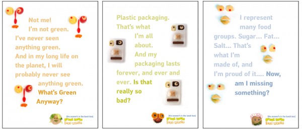
We have all heard about the importance of sustainable design, but how many of us put forth an effort to be environmentally resourceful in each project we undertake?

Yvette Perullo, who received her Masters in Graphic Design from The New England School of Art & Design at Suffolk University in 2008, is on a mission to teach fellow designers and students about the significance of sustainable design. Her efforts have been recognized by GD USA, a news and information magazine for the professional design community.

Yvette is a partner at Re-Nourish, an online tool that raises awareness on sustainable design and provides designers with information about how to make green and practical decisions. Yvette and her partner believe that good design should value people and their environment. However, the nature of graphic design often lends itself to the contribution of waste and overconsumption. Re-Nourish aims to overcome this obstacle.

GD USA isn’t the only organization to recognize Re-Nourish. It also won the Communicator Award of Excellence for an Activist Website and finished as a top-three finalist in the 2009 Cooper-Hewitt National Design Museum People’s Design Award.

Yvette’s work with Re-Nourish began with her thesis project she produced while at NESAD. She says, “The impetus for my thesis project, RethinkDesign.org, was to create a single sustainability resource for graphic designers, knowing the quicker and more accessible the information, the more likely a designer would make greener choices.”

A month after graduation, Yvette met Eric Benson, Assistant Professor at the University of Illinois at
Urbana-Champaign and the creator of Re-nourish.com, at a design conference. After discussing their work with sustainability, Yvette and Eric decided to combine their efforts. After ten months of collaboration with various designers and developers, Re-Nourish.com was launched in July 2009.

Yvette explains, “We expanded the tools such as: searchable greener paper and printer directories, easy-to-digest primers on print, packaging, and digital design, and a Project Calculator that let’s you plug in your project specs and it recommends ways to reconfigure the design to save materials and cost.”

Yvette is also passionate about teaching design and sharing her knowledge on sustainability with her students. In the classroom, Yvette strives to take an “entirely different approach to systems-based thinking.” She says, “The word ‘sustainability’ is often mistaken to mean ‘environmentalism’ but it goes far beyond that.” Since a large portion of products designers create end up in the trash, Yvette stresses the importance of considering the effects on the environment, human health, the economy, and society.

Check out the GD USA feature here and start learning more about sustainable design here!

NESAD Students Semifinalists in The Say Something Poster Project

Three NESAD undergraduate students have made it into the semifinal round of the Say Something Poster Project!

The Say Something Poster Project is a design competition meant to provide designers with the opportunity to create a poster that inspires, motivates, or educates teenage kids. Each year, the ten winning posters are donated to a non-profit organization to install in their facility.

Alan Auger, Olivea Pearl Kelly, and Gabrielle Kozera designed the posters in NESAD’s Fall 2011 Computer Applications in Design class taught by Marie-Anne Verougstraetes.

Olivea Pearl Kelly
Alan Auger
Gabrielle Kozera

Check out the rest of the semifinalists’ posters here.

Voting for finalists will take place the day of the show; each visitor will be invited to vote for their favorite top ten posters. Don’t miss the Boston Poster Show on Saturday February 25th at Fourthwall Project Gallery and support your fellow NESAD students with your vote!

Nick DiStefano Featured on TheDieline

Nick DiStefano, a Masters student at NESAD, had his packaging design work featured on thedieline, a popular packaging design blog.

Nick talks about some of the challenges he faced with packaging design that differs from print or web, “One of the challenges was dealing with the different planes of each package, keeping them consistent…There’s more of a physical experience involved too, and one of the challenges was carrying over and adapting the design as one would open each package; what information or imagery can be revealed as it opens and how it relates to what you see when you first encounter it closed.”

Nick’s packaging line was inspired by his art history background and Italian heritage. The brand name, Novecento, means twentieth century in Italian.

“I love turn of the century art, and from there I started looking at Italian travel posters from the period, especially the more graphic ones that would reduce the essence of the place they were promoting into something simple, but still able to show what they represent.”

Using that same idea of reducing something down to its essence, Nick designed icons for each package in the Novecento line that represented the product inside. Nick describes, “Even if you can’t see the text, I wanted someone passing them by to be able to see those illustrations and recognize what they were, or at least get an idea of what they were about, like using the cow to symbolize milk, or conveying spinning for the writable discs.”

The icons also give each package personality and act as an attention grabber.

You can view more of Nick’s work here.

Join Us at the Graphic Design Master’s Thesis Exhibition

Directions to the Gallery

Exhibiting Designers:
Shi-Min Chin
shiminchin@gmail.com
Emily Roose
thesketchypixel.com
emily.roose@gmail.com
Victor L. Cabrera
victorlcabrera.com
vicgraphicdesign@gmail.com
Jeanie Havens
jeaniehavens.com
jeanie.havens@gmail.com
Kathryn Simonson
simonsondesigns.com
kmsimonson@gmail.com
April Kalix-Cattell
aprilkalixcattell.com
april.kalix.cattell@gmail.com

NESAD students intern at ICON Worldwide in Switzerland

NESAD students are developing their graphic design skills while simultaneously exploring new cultures!

A handful of BFA students have or will be interning at ICON Worldwide in Switzerland. ICON Worldwide is an international marketing agency made up of award-winning designers, developers, and strategists. Two 2011 graduates, Amy Parker and Lauren DeFranza, interned this past summer and three new students, Hope Reagan, Jacqueline Schaab, and Shawn Semmes will be doing the same in the summer of 2012.

Both girls agree that exploring the Swiss culture was a once in a lifetime experience.
Amy Parker describes, “Switzerland offered adventure, new experience, and risk taking. I climbed the Swiss Alps, learned a little Swiss German, met life-long international friends, plunged in glacier water, and discovered real Swiss Cuisine.”

Lauren DeFranza says, “Amsterdam is by far the most beautiful and cultured city in my opinion…it’s the kind of city that was meant for young people to explore. Both Ms. Amy Parker and I had quite the adventure–we met some nice people, tried new things, and only got lost a few times.”

Amy and Lauren also grew as designers.

Amy says she was pushed to develop creative design solutions for clients’ brochures and websites layouts and logo branding. She explains, “I learned how to defeat my own stubbornness, and how to truly listen to input from others with completely different perspectives. My internship experience prepared me to expect the unexpected and inspired me to keep moving forward, growing, searching, looking, drawing, and becoming a better visual communicator. The experience absolutely changed my life.”

Lauren explains how she learned the importance of problem solving, “Problem solving is what graphic designers and web developers do best and I truly believe you can’t have one without the other.”

She also offers some advice on being a life-long student, “From my experience at ICON Worldwide, I know how important it is to understand the language and technology before I can create the design, which is why I will never stop being a student. Remember, as long as you keep yourself open to learning new things, there will always be more room to grow. Don’t ever think you know everything.”

Read more about Amy and Lauren’s experiences at ICON Worldwide at their blogs:
seelaurendesign.tumblr.com
amyparkerdesign.wordpress.com

Best of luck to the new set of NESAD graphic designers who will embark on their own Switzerland journey this summer!

Stephen Plummer Wins Pacemaker Award

The seemingly endless hours of hard work that go into each piece of design are always worth the final product. Stephen Plummer, a graduate student at The New England School of Art and Design at Suffolk University, learned this lesson while working as Editor in Chief at The Bridge, Bridgewater State’s literary journal.

He says, “I developed an appreciation for the finality of publication. Once it’s printed, it’s done, imperfections and all. There are so many nuances to take into consideration (especially when dealing with so much type) that striving to get everything absolutely perfect becomes an enormous task, but ultimately a worthwhile one.”

And he’s certainly right. Stephen and his fellow team members have been awarded the Pacemaker by the Associated Collegiate Press, a national award considered to be the highest honor given to student publications. Design, content, and layout are the three main components taken into consideration.

As Editor in Chief, Stephen played a crucial role in the design and layout of the journal. With helpful input from the entire group, he designed the cover, navigation icons, and certain portfolio pages. Stephen says his experience with The Bridge has also taught him “an invaluable amount about publication, how to best select and place content, and how to make a book that is a cohesive piece.”

Though journal or magazine design may not be in his future, Stephen is sure that the skills he developed from his experience at The Bridge has prepared him for wherever he ends up.

Students Visit The Wall Drawing Retrospective of Sol LeWitt at the Massachusetts Museum of Contemporary Art

What does graphic design have to do with fine art?

A group of NESADSU students grappled with this question as they visited The Wall Drawing Retrospective of Sol LeWitt at the Massachusetts Museum of Contemporary Art (Mass MoCA) in North Adams, MA.

The exhibit featured the work of American minimalist artist, Sol LeWitt. However, the work shown was actually executed by a group of artists who were following Sol LeWitt’s instructions for completion. Associate Professor of Graphic Design at NESAD, Kayla Schwartz, explains, “He believed in following a process wherever it would lead, embracing the unknown and celebrating the unexpected. Placing the execution of his work into the hands of others solidified this belief.”

The end result of Sol Lewitt’s process is a monumental exploration in color, line, grid, pattern, and figure/ground relationships. Sound familiar? Each of these concepts are essential to graphic design. Kayla Schwartz says, “LeWitt was not a graphic designer but few would deny the graphic nature of his work.”

Michelle Pergal, a graduate student at NESAD, said, “Ask me a year ago, and I would say I don’t particularly care for a lot of contemporary or abstract art. My perception has totally changed, however,approaching it from a design perspective. Having this new take on things, I am completely appreciative and fascinated. Sol Lewitt completely captures so many important design principles. His work is not just about shapes and colors. I got the sense that each piece tested and pushed one or several design principles to the brink.”

Designers Engage Student Assistance in Creating Food Faces

We’ve all been warned not to play with our food, but no one warns us against designing with our food.

This past summer, NESADSU students were asked to collaborate with faculty members Rita Daly, Masters in Graphic Design Program Director and Assistant Professor, Kate McLean, in the creation of food faces used to engage third and fourth graders in an initiative to improve the nutritional quality and to encourage the reduction of packaging in home prepared lunch boxes.

The results of the grant, The Green Project Lunch Box Study, awarded to The Friedman School of Nutrition Science at Tufts University, is a pilot program introduced to a select group of Massachusetts school this fall.

The project components included curriculum guides, student workbooks, a packaging guide for parents, and posters promoting the program. Lindsay Peterson, Project Manager of The GREEN Project Lunch Box Study, said “The GREEN materials are printed and we have conducted 9 teacher trainings thus far. The teachers are so enthusiastic about the materials. The project has been a dream to present this to the teachers – I can’t imagine having to sell a campaign that we are not so proud of”.

The designers would like to extend their thanks to the students for their creative and playful contribution to this characterful and important educational program.

Afraa Gutub’s Photograph Chosen for the Aetna International’s 2012 Calendar

Afraa Gutub, a graduate student at The New England School of Art and Design, says she always carries a camera around with her because “you never know what is waiting for you.”

Afraa jumped at the opportunity to capture a scenic moment at the Charles River when she saw the project “Light Drift” by J. Meejin Yoon, an associate professor of architecture at MIT.

When Afraa heard Aetna was looking for photos that represented “Global Events & Festivals from Around the Globe” for their 2012 calendar contest, she knew she had to enter the “Light Drift” picture.

Afraa’s passion for photography developed while she was in NESAD’s photography class. She says, “Ever since I took that course, I started seeing things differently. Everything I see and intend to capture with my lens, I feel is pictured in my head even before capturing it. Photography has become one of my favorite hobbies.”

Afraa believes graphic designers should participate in contests whenever possible “to express their thoughts and deliver their message to the world.”