![]()

Photo Credit : Vikki Quick
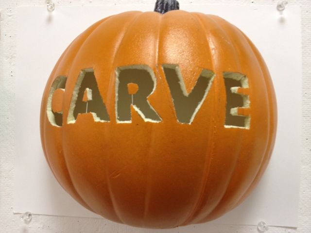
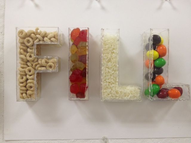
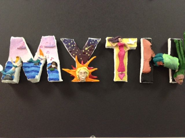
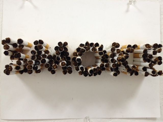
The Museum of Science, Boston opened its newest exhibition which is called the Hall of Human Life. Emily Marsh and Malorie Landgreen, both are MAGD alumni from NESAD were part of this exhibition.
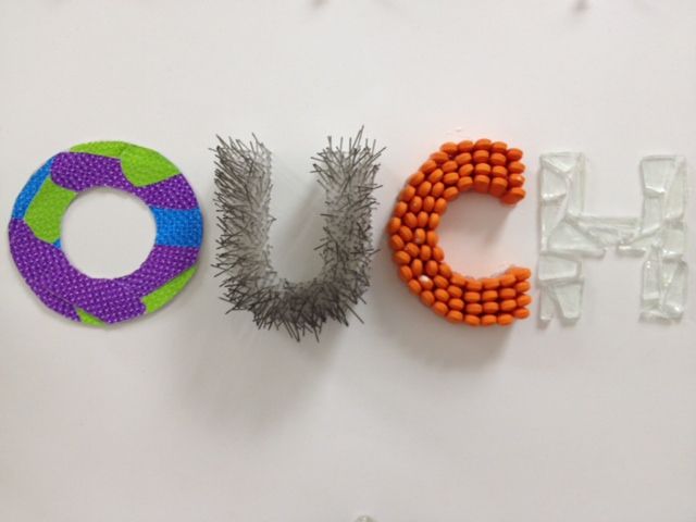
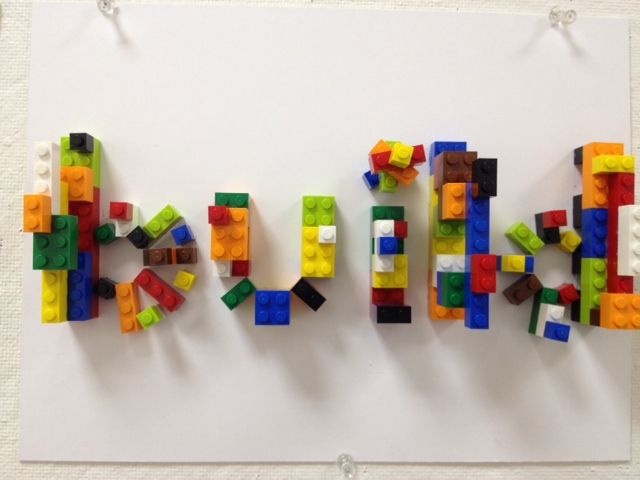
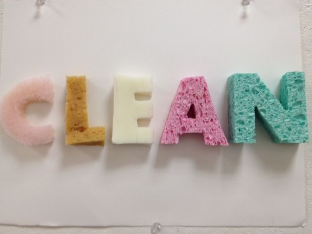
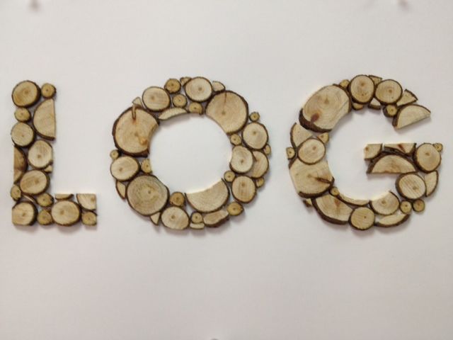
As graphic designers at the museum, Emily Marsch and Malorie Landgreen were in charge for typeface selection enhances the visitor experience.
The Hall of Human Life explores the human biology and health issues such as: inherited traits, personal choices, diet, age and other factors that impact our biology. There are more than 70 interactive exhibit elements that can be accessed by visitors. To become part of the story, visitors can contribute anonymously their own data points at 15 measurement stations, rich with digital media and personal engagement. This exhibition is recommended for grades 3 – 12, therefore the teachers can discuss and share experience with the students during the field trip.
See more about them and their work here :
http://www.monotype.com/blog/beyond-words-museum-exhibit-reaches-visitors-through-type