Category: Events
Homecoming Weekend T-Shirt Contest – Deadline Extended!
T-Shirt Design Contest
The 2013 Suffolk Homecoming T-Shirt contest is open to current Suffolk students. Designs can be submitted through September 23, 2013. Enter now for a chance to win exhibit space at the NESAD reception on October 17, 2013 and a $100 credit to your RAMcard
2013 Homecoming T-Shirt Contest Entry Form (http://goo.gl/y1kBjG )
Homecoming artwork online submission: Please email your submission to homecoming@suffolk.edu with the subject line: NESAD T-Shirt contest submission
Contest Guidelines
You must incorporate:
- Ideas about Suffolk’s first homecoming – (please visit OMC’s website http://www.suffolk.edu/explore/5161.php for more information on use of Suffolk registered marks), the idea of what “welcome home” means at Suffolk to students, alumni, family and friends,the Suffolk community and culture, and the date, October 17-20, 2013 into your design.
- A t-shirt will be given to every registered Homecoming participant, so your design should be one that appeals to the majority of the participants, including Suffolk students, alumni, staff, faculty & family. The design should capture the essence of Suffolk University.
- Designs may include line art and text but no photographs.
- Your design is for the front of the shirt and may encompass an area up to 10×10 inches.
- Design should work with the t-shirt colors., maximum of three colors. The t-shirt for 2013 will be Suffolk’s shades of blue or gold.
- The design must be your own original, unpublished work and must not include any third-party logos or copyrighted material. By entering the competition, you agree that your submission is your own work.
- Contact Tramaine Weekes at tweekes@suffolk.edu with questions.
Submitting an Entry
- Digital entries only. High-resolution images in .eps format are preferred. We will also accept VECTOR art entries in the following formats: .ai, .cdr, .pdf, .svg, .wmf. All fonts must be converted to curves. There should be no embedded bitmap images (jpg, tif, bmp). Colors should be spot with no half-tones.
- Fill out the entry form online and submit artwork to homecoming@suffolk.edu, Attn: Homecoming T-Shirt Contest.
- Submissions will be accepted through Monday, September 23, 2013.
The Fine Print
- Maximum of one entry per person.
- All entries must include a signed artist agreement to be considered.
- Submissions will be screened by the Suffolk University Homecoming Committee for merit and feasibility; finalists will be posted to Suffolk faculty and staff for voting.
- Voting is set up as one vote per person.
- The Suffolk University Homecoming Committee reserves the right to make changes to the winning design before printing, including changes in image size or ink color or t-shirt color.
- By submitting your design, you grant permission for your design to be used by Suffolk University and the Suffolk University Homecoming Committee including, but not limited to, the Suffolk Homecoming website, the 2013 Homecoming t-shirt, posters and future marketing materials.
- The Suffolk University Homecoming Committee reserves the right to final decision.
- The creator of the winning design will win exhibit space at the NESAD reception on October 17, 2013 and a $100 credit to your RAMcard.
Statement of Use
Suffolk University reserves the right to retain artwork produced by students for exhibition and reproduction as part of their program of study while enrolled at the University, and has a non- exclusive, royalty-free, worldwide license to photograph, tape, reproduce, or otherwise use or display student work for marketing, promotional, archival, reference, research, classroom, educational, and other purposes. Students will be credited for the use of such reproductions at the discretion of the University. Reproductions of student artwork may be edited at the University’s discretion, but in doing so, the University will make a good faith effort to act respectfully and responsibly so as not to unduly compromise the integrity of the original artwork.
Redesign : MAGD Thesis Show 2013
We were so proud to have the opportunity of presenting the wonderful thesis works of Master of Graphic Design graduates at Adam’s gallery, 120 Tremont St. (Suffolk Law Building). The opening show that took place on Friday, August 23rd 2013 was well attended by the family, friends, alumni, instructors, and regional designers around Greater Boston area. The works are unique, well executed, innovative and interesting for public viewing.
Come to visit and see all of the works from our talented MAGD graduates at Adam’s Gallery until mid of November 2013!
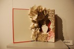
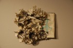
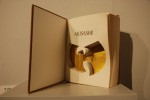
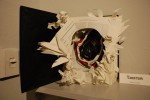
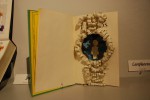
Spines: An Exhibition of Reinvented Discarded Books
Spines: Central Axis from which Strength is Derived.
Literature, as a medium, has the capacity to convey our ideas, our emotions, and our thoughts. Such notions, be they factual or fictional, are bound together by the spine of the book. It is a structure designed to burden the weight of the context held within the pages: the tangible attribute that differentiates a book from a collection of letter forms.
The Spines exhibition is a collection of discarded books, appropriated and reinvented by the students of Graphic Design I, under the direction of Rita Daly. These pieces are our ideas, emotions, and thoughts, factual or fictional: their content, translated into original conceptions, remain founded upon and supported by the spines.


Faculty Exhibition at Sargent Hall
The New England School of Art and Design Faculty Exhibition opens on February 1st and remains up until March 5th, in Sargent Hall at 120 Tremont Street. The reception is on Friday, February 1st from 5:30 until 8 pm.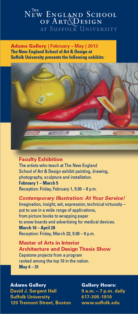
Italy Meeting Today at 1 pm in Room 257
There is a meeting for those interested in the Italy Program in Room 257 on Tuesday November 13th at 1 pm. For more information please contact Professor Wallace Marosek at wmarosek@suffolk.edu or 617.944.42.66 or Professor Grace Consoli at gconsoli@suffolk.edu.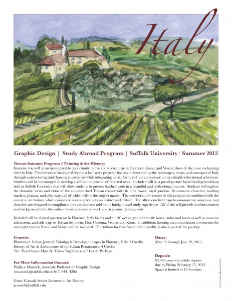
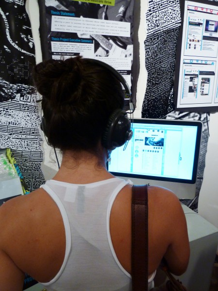
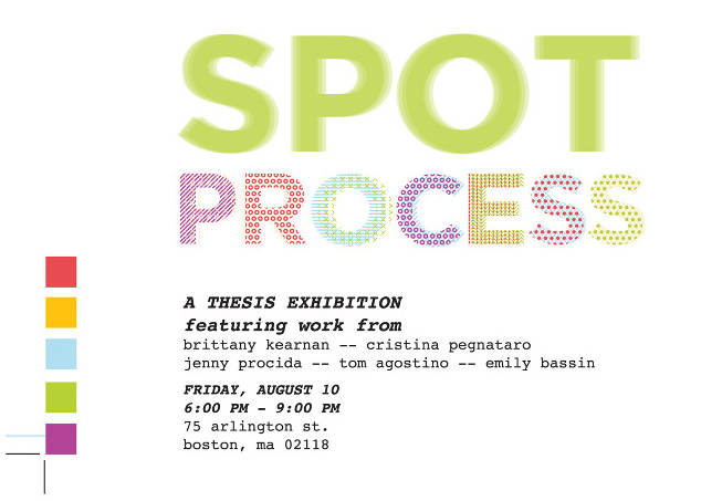
Spot Process – MAGD Graduate Show Opening – August 10, 2012
![]()
 Emily Bassin, Jenny Procida, Cristina Pegnataro, Brittany Kearnan, Tom Agostino, and MAGD Program Director Rita Daly, at the opening celebration.
——————————————————-
Emily Bassin
Clear Report

Project Summary
I designed the branding and concept for Clear Report – an unbiased, investigative reporting and rating publication about corporate social responsibility. Through researching corporate social responsibility, I identified a need to combat the “good-washing” that is so prevalent in today’s corporate marketing campaigns, and to encourage corporate transparency. “Good-washing” is one-sided information about the positive impact that a corporation has on society. It comes directly from the corporation’s marketing departments and is not always accurate or transparent. I found that incentives and pressures need to affect the fiscal success of the company in order for companies to choose socially beneficial programs. By designing this system and brand for Clear Report, I was able to find a successful solution to pressure corporations into make more socially beneficial choices by increasing consumer power through knowledge.
——————————————————-
Jenny Procida
Men On Ice, A Visual Exploration of Men’s Figure Skating

Project Summary
Men on Ice is an exploration of gender expression in figure skating. In the United States, figure skating is viewed as a feminine sport, and thus, the promotion of the men’s events often falls to the wayside. Throughout the thesis process, I explored the unique spectrum of male expression as seen in a stereotypically feminine context, as well as the artistic qualities of figure skating that set the sport apart from traditionally masculine sports.
Based on my research, I chose to create advertising in the form of banners, print advertisements, and a revamped logo for the International Skating Union. This new promotion of the sport celebrates the complexity of figure skating, as well as the many forms of personal expression found on the ice.
——————————————————-
Cristina Pegnataro
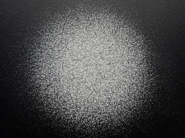
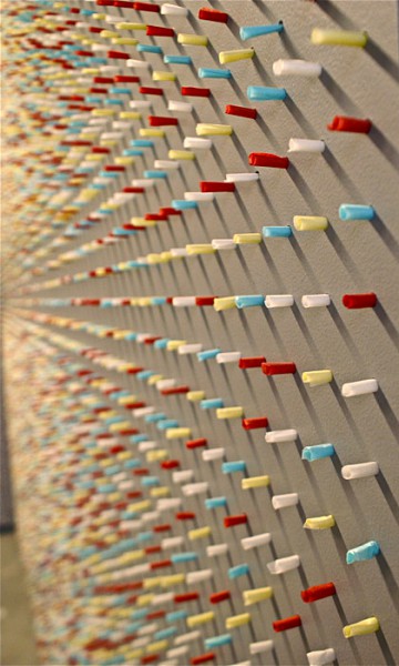
Vigilantibodies: A Food Allergy Awareness Campaign


Project Summary
I approached the thesis process as an opportunity to utilize design to bring clarity and accessibility to issues regarding human health. With a topic such as food allergies, so heavily rooted in science and research, it was important to identify the key characteristics that would resonate with the public and benefit from creative solutions. In order to “redesign” the way people think about food allergies, the public must gain knowledge about the problem through empathy with those affected.
Health and wellbeing are fundamental human rights, yet those with food allergies must constantly be on the defensive. No matter how vigilant they are, there will always be a careless chef, a hidden ingredient, a negligent babysitter, a contaminated utensil, or a mislabeled package. With the safety of the food-allergic in communal hands, it is important that the general public understand the daily challenges. Exposing the hidden dangers will demonstrate the potential severity of food allergies in order to influence behavior and encourage dilligence.
Vigilantibodies is a food allergy awareness campaign that aims to foster a sense of community and shared responsibility while at the same time empowering those with food allergies to view themselves as strong individuals.
——————————————————-
Bittany Kearnan
IM Celebrating Individuality
IM is an online space for middle and high school aged youth to express themselves and celebrate who they are through videos.
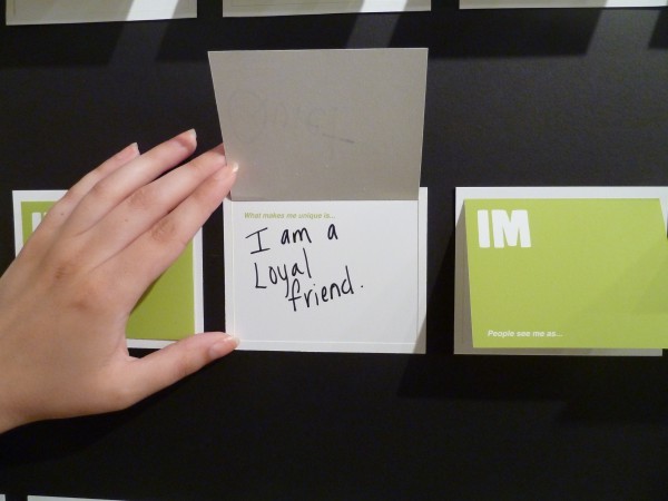

Project Summary
For my thesis project I created IM, an online community for middle and high school aged students to express themselves and celebrate who they are through short videos. The goal of this project was to challenge the public perception of our surface self, and show that we may be seen as one thing, but we are made up of so much more.
Through my research on reality TV, I found that we relate to participants on the show based upon exaggerated stereotypes that require little to no background information. How we perceive people on reality shows is the same as in our daily lives, and we make judgements based on how we perceive a person without knowing their personal story.
IM is geared towards middle and high school aged students who are in the midst of establishing their own identity. They are trying to figure out who they are, how they want to be seen, and how to express themselves. IM not only gives them a voice, but also lets them connect to peers who are like them, different than them, or who inspire them. It creates a community that celebrates what makes each of us unique, and what does not fit into a stereotype.
IM is designed to be interactive and engaging, encouraging middle and high school aged students to visit the website to watch videos, make their own videos, and reach out to others to create a community. The bright, lively colors create an inviting tone, while the black and white videos mute out the background so that the focus is on the people’s words and their stories. The videos highlight each person’s unique handwriting, making their story both personal and expressive.
——————————————————-
Tom Agostino
Bandwagon, Bands be heard


Project Summary
Bandwagon is a web-based community designed specifically for the promotion of bands and musicians not involved with a major media corporation contract, i.e. Sony, Universal, EMI or Warner. These money hungry corporations dominate the music industry accounting for 75% of the entire music market in the United States. There’s more music out there!
Utilizing web and mobile application design along with a comprehensive branding system, Bandwagon offers independent (non-major label) bands and musicians a community to increase their exposure, distribute their music to a wider audience and an environment to continually grow their fan base. The Bandwagon community also provides music lovers and the general public access to music and bands they wouldn’t hear on popular radio and television stations or see their music sold in big box chain stores e.g. Best Buy or Target.
The goal of Bandwagon is to help independent bands thrive, keeping the power of music creation, control and distribution in the hands of the musicians, bands and supporters and away from dominate media corporations.
——————————————————-
 Old Friends Return: Malorie Landgreen 2010 & Orpha Rivera 2011 MAGD graduates meet again.
Graphic Design Master’s Student Exhibition
Master of Arts in Graphic Design Student Exhibition: Spot Process
Suffolk University Art Gallery
75 Arlington Street 2nd floor
August 10 – 30, 2012
Reception: Friday, August 10 6:00 – 9:00 PM
Students Visit The Wall Drawing Retrospective of Sol LeWitt at the Massachusetts Museum of Contemporary Art
![]()
What does graphic design have to do with fine art?
 A group of NESADSU students grappled with this question as they visited The Wall Drawing Retrospective of Sol LeWitt at the Massachusetts Museum of Contemporary Art (Mass MoCA) in North Adams, MA.
The exhibit featured the work of American minimalist artist, Sol LeWitt. However, the work shown was actually executed by a group of artists who were following Sol LeWitt’s instructions for completion. Associate Professor of Graphic Design at NESAD, Kayla Schwartz, explains, “He believed in following a process wherever it would lead, embracing the unknown and celebrating the unexpected. Placing the execution of his work into the hands of others solidified this belief.”
 The end result of Sol Lewitt’s process is a monumental exploration in color, line, grid, pattern, and figure/ground relationships. Sound familiar? Each of these concepts are essential to graphic design. Kayla Schwartz says, “LeWitt was not a graphic designer but few would deny the graphic nature of his work.”
Michelle Pergal, a graduate student at NESAD, said, “Ask me a year ago, and I would say I don’t particularly care for a lot of contemporary or abstract art. My perception has totally changed, however,approaching it from a design perspective. Having this new take on things, I am completely appreciative and fascinated. Sol Lewitt completely captures so many important design principles. His work is not just about shapes and colors. I got the sense that each piece tested and pushed one or several design principles to the brink.”