Bryan Vermes - Blog

Just another Blogs.cas.suffolk.edu site

By

BLOG ENTRY: Solar Cell Lab Analysis

BLOG ENTRY: Solar Lab Reflection

The Mission of Our Experiment

Our solar generation lab was utilized to continue building on our foundation of knowledge about solar energy (specifically that we had gotten from the class text). In addition, we were working to understand the relationship between voltage output of a solar cell and light intensity. Key question: How would distance, which we utilized to change intensity, impact voltage production? Further, what colors of light provide greater levels of voltage?

The experiment was to be used to confirm the conclusion that light intensity is positively correlated with voltage produced. With greater intensity, there will be greater voltage. The graphs shown later in this blog entry emphasizes these findings.

How did the lab focus on this issue?

Our lab focused on the different wavelengths of energy hitting the solar panel (through the utilization of color filters) and on the distance from the light source. The distance of the light source was underscoring the importance of light intensity.

These two different variables allowed an in-depth exploration of how energy wavelengths and light intensity impact the amount of voltage produced from a solar cell. Light intensity and the wavelengths from the source impact the speed of the voltage/current.

Trial Set One: Changing Distance

In the first six trials, we used LabView to measure the amount of voltage produced on the solar cell while altering the distance away from the solar cell. In these trials, we left the light unfiltered. The only variable changing with the experiment was the distance between the light source and the solar cell (which was measured by a ruler in centimeters).

Through our understanding of the relationship between light intensity and voltage produced, we concluded (before the experiment) that there would be a decrease in voltage produced as we increased the distance between the solar cell and the light source. This was an inverse relationship.

The table and the graph below indicate the relationship between the distances we used and the amount of voltage recorded on LabView:

Distance (CM) Average Voltage

0

0

0

0.407417

2

0.385606

4

0.359946

6

0.335569

8

0.334286

voltage vs distance

As we had expected, as we increased the distance between the solar cell and the light source, the amount of voltage decreased. This is what we expected due to the diminished light intensity as light intensity is directly correlated with voltage production.

Trial Set 2: Filtered Light Source

For our second set of trial runs, instead of changing the distance between the light source and the solar cell, we filtered the light source. We left the distance constant, by pressing the light source directly onto the solar cell. To analyze the impact of the color of the light source, we used four different colored tinted sheets: Blue, green, red, and yellow.

This experiment built off of our class lecture understanding that different wavelengths of energy will go through to the solar cell with different tinted sheets:

Wavelength Map

Analyzing the class diagram, we concluded that the colors with longer wavelengths have a lower amount of energy. We inferred that the filters of the darker colors would produce smaller voltage. This is because we noted that silicone solar cells absorb less of the higher energy, and are more able to generate voltage with red/yellow colored radiation.

The table and graph below indicate the voltage recorded by LabView during each color-filtered trial run:

Color Average Voltage
Blue

0.330437

Green

0.3544814

Red

0.357812

Yellow

0.386889

voltage vs color

The graph and table confirms our understanding that the light filters (red/yellow) led to greater current and voltage production. On the other hand, the darker filters decreased the amount of voltage produced.

How did this heighten our understanding of voltage produced in a solar cell?

This experiment underscored the relationship between light intensity and voltage produced. There was a clear, defined positive correlation between the two. In addition, it also highlighted the speed of light formula that implied the wavelength of energy would significantly impact the amount of voltage produced. As we filtered the light source with darker colors, the amount of voltage produced decreased as the silicone solar cell was more receptive to the red/yellow filters. These two relationships built on our knowledge of solar energy prior.

Conclusion

This lab was a unique and interesting way to further enhance our understanding of solar cells. Because this form of energy is being increasingly utilized, it felt timely and appropriate! The lab went smoothly for Rebecca and I, and was definitely one of our favorite experiments so far!

By

BLOG ENTRY: Solar Power Projects Worldwide

BLOG ENTRY: Solar Power Projects Worldwide

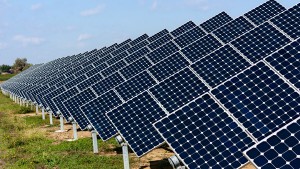
Often discussed as one of the pathways out of the global climate crisis, solar power has had mixed success worldwide. Deployment is moving swiftly in the United States and China, while investment in the source has essentially collapsed in some countries such as Japan. Despite years of debate over tax credits and the need for development of more energy storage technologies, solar power is still rapidly growing as a source of electricity for the global economy.

solar-panels-homepage

Beginning with an overview of the two different forms these energy projects are under, they center around either solar thermal collectors or photovoltaic cells. The latter is more complicated and has been the subject of more intense research in recent years. The collection of thermal radiation involves the use of a fluid passing through a heat sink, which is exposed to sunlight. This can be used as a heat source, or can be concentrated in a turbine to generate energy. Photovoltaic cells use semiconductors to convert protons to electrons, which then generates energy.

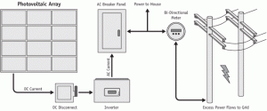
Furthermore, photovoltaic systems are becoming more popular. The silicon solar cell was initially developed in the 1950s. While initially being very expensive, development has been continuous and more affordable options are now available. Unfortunately, this has led to less efficiency on some of the systems. A simple diagram of a photovoltaic system is shown below.

photovoltaic_system

In the US, solar energy has played a minor role since the advent of industrialization. It provides three tenths of 1% of energy consumed in the United States. Deployment has rapidly grown in recent years, with support of the government. Capacity has increased from around 330 megawatts in 1997 to over 6,000 in 2013.

The main drawback to solar power deployment has been a lack of constant supply and reliability. Changing positions relative to the sun, and atmospheric conditions, have led to concerns about the stability of solar power. Furthermore, a significant amount of energy is lost as it is transported through power lines. The cost of the technology for solar power, relative to the energy produced, makes the source expensive when compared to other alternatives. As highlighted in the class text, a typical system for a single residence carry about a 3-5 kW capacity. The cost runs as high as $8,000 per kW, bringing the cost beyond $40,000.

091009_googlesolar

This doesn’t leave solar power without its believers. A key American project is taking hold with a high-profile corporate backer! Google is investing to convert an old oil field into a solar power plant. They are providing about $145 million dollars in financing, so SunEdison can build the plant. Google has been a strong backer of renewable energy in the past, and the plant will be able to power 10,000 homes. It will be the 17th renewable energy project that Google has invested in, underscoring the importance of partnerships between different private firms to increase deployment of solar power.

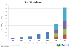
Projects like these has pushed solar power to the level of being able to power more than 2 million American homes. There were 140,000 new solar power installations in the country in 2013.

2011 Year in Review Chart

The graph above underscores the increase in American solar capacity in recent years.

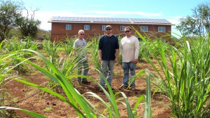
Looking away from the mainland US to Hawaii, a solar-powered vodka distillery has caught the attention of the web. The vodka is distilled from sugar cane and blended with deep ocean minerals from the depth of 3,000 feet off the coast. The entire operation is powered by a 61.2kW solar PV array. According to the company, 100 percent of their power comes from solar power and relies on lithium ferrous phosphate batteries.

IMG_27612

The project has been used by solar power advocates to point to what is possible at a larger scale, given greater investment in the energy source. Environmentalists underscore the broad, 360-degree approach at environmental protection within the context of solar energy. The distillery is able to generate power without the destruction of a broad area of forest, and is concurrently limiting carbon output.

India-to-get-first-floating2

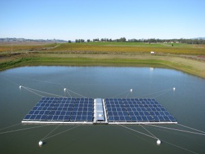
Lastly, the final project I’ll be analyzing is across the world in India. The country is planning the world’s first floating solar power project. India’s leading hydropower generator, National Hydro Power Corporation, is planning to set up a 50 MW solar photovoltaic project, which will be over bodies of water. The cost of the project will be around $70 million dollars. The floating solar power plant technology was developed by a team led by SP Gon Choadhury. There are hopes that this project will provide a template for future floating solar power plants in the future.

While solar power provides a small portion of the American and global energy supply, its growth is noteworthy and likely to continue. With continued cooperation between different stakeholders, and the advancement of deployment technologies, the energy source will likely be seen as a more viable alternative in the future.

References:

http://www.renewableenergyworld.com/rea/blog/post/2013/11/top-five-cool-renewable-energy-projects

http://www.huffingtonpost.com/2014/09/10/google-solar-power_n_5796580.html

http://instituteforenergyresearch.org/topics/encyclopedia/solar/

http://www.seia.org/research-resources/major-solar-projects-list

http://www.seia.org/research-resources/solar-industry-data

http://cleantechnica.com/2014/07/02/india-plans-worlds-largest-floating-solar-power-project-50-mw/

By

BLOG ENTRY: Energy Generation Lab Analysis

BLOG ENTRY: Generator Lab

What was the goal of this lab?

The main objective of this lab was centered around Faraday’s Law. This law states that changing magnetic fluxes through coiled wires generate electricity. When you increase the changes in magnetic flux, the greater the currents and the voltages will be. Our lab was set up to allow us to explore this relationship between magnetic fluxes and current, and see the positive relationship between the two variables.

How did we do this?

For our lab, we would be analyzing this energy relationship with a shaking tube. Our shaking tube had a magnetic inside, along with a coil of wires. By seeing if more shakes would equate to a greater amount of voltage, we would confirm the findings of Faraday’s Law.

The Experiment

To permit the recordings of our data, we utilized LabView and an Excel spreadsheet to record the amount of shakes and the amount of voltage for each trial set. In total, we conducted nine different trials. For each set of three, we did a different number of shakes (from a fast pace, to a medium pace, and finally a slow pace). Each pace would be examined for 30 second intervals.

By looking at three different speeds of shaking the magnet, we were highlighting Faraday’s Law and exploring the relationship between the number of shakes and the amount of voltage produced. The amount of voltage recordings per shake was numerous, spanning well over 100 recordings. A sampling is shown below of one set of shakes:

Number of Shakes Voltages

71

0.17776

71

0.34455

71

-0.13016

71

0.4087

71

0.06229

71

-0.05318

71

0.07512

71

-0.02752

71

0.12644

71

0.08795

71

-0.01469

71

0.11361

71

-0.04035

71

0.03663

71

0.06229

71

0.04946

71

0.03663

71

0.04946

71

-0.01469

71

-0.06601

71

-0.00186

71

-0.04035

71

-0.05318

71

-0.00186

71

0.03663

71

-0.05318

71

0.11361

However, we were able to make our analysis more manageable through our calculations. First and foremost, we utilized the sum of squares formula (simply squaring the voltage recording and then adding them up) to take out any negative recordings. The negative voltages would distort the relationship shown between those shakes and the energy produced. Furthermore, for each number of shakes set, we summed up these squared data entries. By summing up the data, we were able to look at the total amount of energy produced in each 30 second span. Shown below is our calculations of the squared voltages from the 71 shakes data sampling provided prior:

Voltages Squared Voltage

0.17776

0.031598618

0.34455

0.118714703

-0.13016

0.016941626

0.4087

0.16703569

0.06229

0.003880044

-0.05318

0.002828112

0.07512

0.005643014

-0.02752

0.00075735

0.12644

0.015987074

0.08795

0.007735203

-0.01469

0.000215796

0.11361

0.012907232

-0.04035

0.001628123

0.03663

0.001341757

0.06229

0.003880044

0.04946

0.002446292

0.03663

0.001341757

0.04946

0.002446292

-0.01469

0.000215796

-0.06601

0.00435732

-0.00186

3.4596E-06

-0.04035

0.001628123

-0.05318

0.002828112

-0.00186

3.4596E-06

0.03663

0.001341757

-0.05318

0.002828112

0.11361

0.012907232

Lastly, we summed up the squared data from that sampling to come up with the total power produced with 71 shakes:

Number of Shakes Sum of Squared Voltages

71

.425070219


Full Set of Calculations in Table Form

The data for each number of shakes is shown in a table below.

Number of Shakes Sum of Squares (Power/Voltage)

71

0.42507

73

2.137622

71

2.532251

99

8.553348

110

10.1686

113

13.04881

50

1.844339

48

0.465344

What this table shows is the result of squaring each data entry of the 30 second intervals, and summing them up using an excel spreadsheet (as shown in the previous tables). A slight trend can be shown between the number of shakes and the amount of voltage. As a team, Rebecca and I recognized that our squared voltage sums were lower than the recordings of some other groups. However, we were still able to see the relationship in a graph.

What did our calculations show?

Following the summing of the squares of each pace of shaking, we put our data into a graph form. To show the relationship that Faraday’s Law was discussing, we plot a graph on Excel that had power on the y-axis and the number of shakes on the x-axis. To confirm Faraday’s Law, we expected to see a positive relationship. As stated in the law, the greater the magnetic flux, the greater the amount of power/voltage that is produced.

A graph of our data recordings is shown below:

power vs shakes

The graph underscores the positive relationship between the number of shakes and the voltage produced. As we increased the number of shakes, the amount of energy increased.

Conclusion

This lab was a cool way to enhance our learning on energy generation, specifically highlighting Faraday’s Law. By conducting a series of different shake paces, we successfully confirmed the law’s findings. It was a little more stressful than usual because of some technical issues Rebecca and I had, but it all worked out in our favor!

energy generation rebacca

By

BLOG ENTRY: Fisker and Tesla

BLOG ENTRY: Fisker and Tesla

Tesla and Fisker had both been electric-powered car pioneers, leading the industry in their drive to build cars that can take people further distances with a reduced environmental impact. In these electric engines, the motor acts as a generator. It does this by turning mechanical power into electricity in the vehicle. Tesla has flown, with profits steady and the company’s future bright. On the other hand, Fisker failed to maintain momentum from the green movement. Following support from the US government to promote production of luxury electric cars, the company has failed to repay such loans. Further, visionary executives have left the company at a standstill. From 2013 to 2014, production was halted at Fisker with constant concerns of bankruptcy.

The chart above highlights the success of Tesla motors. Revenues have increased significantly in recent years, according to The Street.

Focusing on the technical end of the products, the roadster motor by Tesla only has one moving piece, the rotor. This eliminates the need for a conversion of linear motion and doesn’t have mechanical timing issues that may be found in an internal combustion engine. Furthermore, in these engines, the rotational energy is available immediately when the accelerator is pressed. The wide torque band that is available right away eliminates the needs for multiple gears, with the engine only having one. On top of that, the phases can be switched into reverse electrically. It’s that simple for the driver.


In terms of the battery itself that needs to be charged, the roadster motor is so efficient that it can work to recharge the battery itself. When the car is slowing, without the accelerator being pressed, the energy can be captured to work to restore the battery life.

The Roadster motor has two components, the rotor (as discussed) and a stator. The rotor, which is an essential piece of the motor, is surrounded by the stator. This piece is stationary and works to create a magnetic field around the rotor, which induces a current. This current creates a second magnetic field that “chases” the rotating stator field. These two pieces create torque.


The stator is put together with winding copper wire coils which go through thin steel plates. The copper wire conducts electricity, which goes to the motor. Three sets of wires conduct one phase of electricity each. These waves of energy supply a smooth current, which creates a magnetic field. The placement of the copper coils relative to the stator allows the magnetic field to move in a circular motion.

Copper bar conductors move through the magnetic field, which creates induction. Because the magnetic field keeps moving, the rotor is always trying to catch up. This interaction creates torque, which is used to power the vehicle.

The benefits of these vehicles are wide-ranging. They’re special because they emit 15 tons of CO2, compared to 160 tons of CO2 of conventional engines. In addition, they offer a major cost saving in terms of “re-fueling” the vehicles. Recharging a battery costs about $1.41 per gallon, compared to $3.50 for a conventional vehicle. Due to increased support from the government, there are now over 8,500 electric power stations in the country. In addition, there are over 20,000 charging outlets. As these numbers continue to grow, it will allow for more consumers to take advantage of cost savings.

PHEV’s and EV’s can reduce costs significantly because the cost of the electricity needed is relatively smaller than the cost of conventional fuel. Efficiency on these vehicles is often measured by MPGe, which can run upwards to 100 MPGe (equievalent).


Because of these wide ranging gains from switching over to electric vehicles, Tesla is projecting over 500,000 vehicles in production annually by 2020. This is huge for a company, which as of 2013, had a $17.5 billion dollar market value. Fisker is also looking to regain its footing after years of decline. In 2013, the company had $21 million dollars seized by the American government to begin repaying loans it received as part of an economic stimulus package in 2009. This shows that despite room for growth in the electric car industry, it still takes stealth marketing and production capabilities to allow for continued success.

References:

http://www.teslamotors.com/roadster/technology/motor

http://visual.ly/how-electric-cars-and-tesla-model-s-work

http://www.nytimes.com/2013/04/24/business/fisker-broke-down-on-the-road-to-electric-cars.html?pagewanted=all&_r=0

http://www.autonews.com/article/20140219/OEM04/140219834/fiskers-new-owner-teams-up-with-lutz-on-v-8-karma

By

BLOG ENTRY: Pulley Lab Reflection

Blog Entry: Weight, Work Lab

What was our mission?

This lab allowed us to utilize the robots, along with varying masses and velocity measurements, to explore Newton’s 2nd law.

The law can be stated in formula form as F = ma.

Furthermore, the variables explored would heighten our understanding of the law of conservation of energy. This law states that energy is not created or destroyed, but is instead changed between different forms. To allow us to explore these rules, we measured velocity and acceleration using the computer program LabView. LabView also permitted the manipulation of power as a tool to further enhance our understanding of Newton’s 2nd law.

How did these experiments heighten our understanding?

Our lab focused on the conservation of energy through Newton’s 2nd law. To allow us to explore these laws, we did multiple test runs which manipulated one variable in each set of trials. By focusing on one variable at a time, we were able to highlight different relationships that would confirm the validity of these scientific rules.

Trial Set 1: Constant Mass

For our first four trials, we used the LabView program to alter the amount of power employed to carry the weights up the pulley. However, in these trials, we would maintain the same mass. By keeping mass the same, we are able to use the formula under Newton’s 2nd law to create a hypothesis on what the results will be. If mass is remaining the same, but force is going to increase, it is very likely that acceleration must also increase.

The following table shows the data recorded for the first set of trial runs:

Speed (RPM) Battery Discharge Mass (kg) Power Time (sec) Acceleration (RPM/sec.)

30.850514

111

0.09

50

4.511

6.838952

66.496526

139

0.09

75

2.351

28.284358

106.949352

110

0.09

100

1.415

75.582581

106.567093

70

0.09

125

1.406

75.794519


Furthermore, a graph below underscores the relationship between acceleration and power:

constant mass


As expected, as we increased the force imposed onto the pulley from the robot, the acceleration also increased. This matches with Newton’s 2nd law.

Trial Set 2: Constant Power

For our second set of trial runs, we did not adjust the power on LabView. Instead, we used the weights provided to us to alter the mass being carried up the pulley. This would allow us to focus on the other half of the Newton’s 2nd law. If mass were to increase, we would hypothesize that acceleration would have to decrease. This is given that the power is remaining the same. Without the drop in acceleration, the formula F = ma would not balance.

mass

The following table shows the data recorded for the second set of trial runs:

Speed (RPM) Battery Discharge Mass (kg) Power Time (sec) Acceleration (RPM/sec.)

23.724792

153

0.08

50

5.058

4.690548

24.856242

139

0.1

50

5.391

4.610692

15.795495

139

0.12

50

7.576

2.084939

2.115704

194

0.16

50

9.847

0.214858


Furthermore, a graph below underscores the relationship between mass and acceleration:

constant power


Fitting with the formula/law, the acceleration decreased as mass increase. The two variables have an inverse relationship. This data means that the two will still equate to the power (force) that we input onto LabView, re-enforcing Newton’s 2nd law.

How did this enhance understanding of the law of conservation of energy?

For the last portion of our lab, we measured the height of the pulley and analyzed the battery discharge information from LabView. What this allowed us to do what look at the relationship between the amount of battery utilized and the potential energy, which can be measured with the following formula:

PE = mgh

We divided this by the time on LabView, using Microsoft Excel, to get the needed data for our graph below. The information is also shown in table form:

PE chart


Gravity(m/s2) Mass(kg) Height (km) Time (sec) PE PE/T Battery Dischage

9.8

0.08

0.04

5.058

0.158619

0.03136

153

9.8

0.1

0.04

5.391

0.211327

0.0392

139

9.8

0.12

0.04

7.576

0.356375

0.04704

139

9.8

0.16

0.04

9.847

0.617604

0.06272

194

9.8

0.09

0.04

4.511

0.159148

0.03528

111

9.8

0.09

0.04

2.351

0.082943

0.03528

139

9.8

0.09

0.04

1.415

0.049921

0.03528

110

9.8

0.09

0.04

1.406

0.049604

0.03528

70


We noticed that our graph, disregarding the two outside data points in the top right and lower center, was generally stable. While we would have expected more of an increase in battery discharge given a higher PE/T value, we attribute it to the fact this lab did not require heavy battery usage. However, we were able to conclude that this is an area we would see the conservation of energy between the potential energy and energy used on the pulley.

Conclusion

This lab was a fun, interactive way to enhance our understanding of Newtons’ 2nd law and the law of conservation of energy. Furthermore, my relationship with Rebecca continued to strengthen as we went through each trial. We communicate clearly and divide up the tasks without any issue! I can’t wait to continue enhancing my understanding of the class material in the lab!

recording

By

BLOG ENTRY: Coal, Natural Gas, Nuclear, and Solar Power

Coal, natural gas, and nuclear power have all been discussed widely in the larger attempt to have an “all of the above” energy policy in the United States. The three are a large portion of American energy generation and consumption, and have long been part of the overall energy independence conversation. As seen in the graph below, in addition to petroleum, the three make up a vast majority of US energy consumption. (The graph is dated back to 2007, however renewable fuels have yet to capture a large portion of American energy usage).


A key element to this conversation has centered around the environmental impact of each of the different energy sources. First and foremost, coal and natural gas are both criticized by environmental groups for having a negative impact on the overall battle against climate change. While natural gas emits less carbon than coal, both continue to be contributors to the American carbon footprint.

Specifically, the graph below underscores the carbon output from each area.

As argued in the class text, it’s imperative for both energy sources that the country invest in updating power plant technologies. While increased efficiency is possible to technological advancements, we have been slow to adopt such upgrades. CO2 emissions from gas combustion is 16% of our GHG emissions, and 29% comes from coal. We have the potential to dramatically reduce our coal emissions through the modernization of coal plants. Coal plants have an average 33% efficiency in the US according to Richter, and that number could be increased above 40% if newer technologies were employed.

Furthermore, all three are similar in the sense that they often bring about safety concerns. Nuclear power specifically, while emitting no carbon emissions, has been slammed due to radiation concerns and other safety issues. Furthermore, attempts to allow for storage of nuclear waste (such as in Nevada) have fallen flat due to environmental concerns. It has been argued that many of these criticisms are misguided and unfounded, as the plant in Chernobyl had none of the safety protections you would find in an American power plant (according to Richter).


Furthermore, due to concerns over radiation and safety, nuclear power has been the subject of many layers of red tape. The accident at Three Mile Island led to a large increase in orders from the Nuclear Regulatory Commission. Regulatory costs and public backlash have not allowed for a construction if a new nuclear power plant in decades, with approval of the energy source below 50% for many years. The graph below, from the US Department of Energy, underscores that some of the concerns over radiation may be groundless.

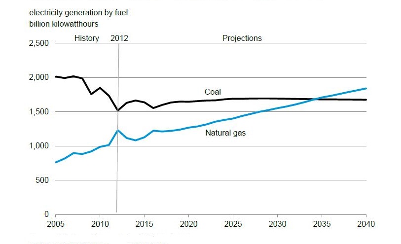
While the overall reason for the lack of construction is subject to debate, Forbes Magazine reports that harsh competition from natural gas and coal production is also a piece of nuclear power’s struggle to keep up in the U.S. It should be noted that coal is also facing a decline in comparison to natural gas growth. Despite hopes for a turnaround due to the drop in coal costs, natural gas continues to expand rapidly due to the usage of fracking. Coal and nuclear power have leveled out, while natural gas has continued to thrive in the new economy.

A concern I have about the overall image of the three energy sources is that there seems to be a perception that they are all villains in the fight for environmental protection. While it is ideal that renewable fuels take the lead, it’s unlikely that such fuels could truly power the American economy in the near future. With increased research in carbon capture (as suggested by the class text), a modernization of natural gas plants, and increased oversight of nuclear power, the American public could reap the benefits of increased energy independence while concurrently driving down carbon emissions.

On the political end, the President has spoken out in support of increased nuclear power production. Furthermore, Obama spoke positively of natural gas production as a pathway to lowering emissions in recent energy speeches. On the other hand, the administration has been cool towards increased coal production and has proposed carbon standards that would likely raise costs for coal-based power plants. With these policies in place, I would expect continued decline in coal for America’s energy future.

I want to briefly discuss solar power, in addition to the big three highlighted prior. Solar energy is divided between solar photovoltaic and solar thermal electrical generating systems. In the heat and hot water system, water is pumped to the rooftop where it is heated by the sun. The hot fluid goes to a storage tank, where domestic water is pumped through a coil inside the tank. The hot water can then be used for a variety of reasons. Photovoltaic installations have been increasing, with the first cell being developed in the 1950’s. The concern is the lack of efficient storage of the energy produced.

Solar thermal electric systems can store energy, but they cannot produce much energy on an overcast day and the added cost of steam systems make it unlikely to be a viable alternative. Solar power is extremely environmentally friendly in a carbon sense, despite concerns that it takes too much space. I wanted to demonstrate that while it is a good alternative, it lacks a lot of the technologies needed to fully replace fossil fuels. The big three discussed prior can be modernized and made more efficient.

Investments should continue into carbon-free renewable fuels. With that said, it cannot and should not be the sole focus of carbon reduction activists. Whatever the mix may be, carbon emissions are continuing to be a greater concern for the overall public and will likely play a big role in future energy generation decisions.

Sources:

http://www.bloomberg.com/news/2014-02-13/coal-burns-brighter-as-utilities-switch-from-natural-gas.html

http://www.npr.org/2014/02/14/276782467/report-burning-natural-gas-is-better-than-using-coal

http://www.forbes.com/sites/jeffmcmahon/2013/04/23/4-reasons-coal-declines-even-as-natural-gas-prices-rise-eia/

http://www.forbes.com/sites/energysource/2014/02/20/why-the-economics-dont-favor-nuclear-power-in-america/

http://www.eia.gov/tools/faqs/faq.cfm?id=427&t=3

http://www.forbes.com/sites/michaelkrancer/2014/02/12/obama-energy-official-nuclear-plants-essential-to-our-carbon-reduction-goals/

Class Text: Beyond Smoke and Mirrors by Burton Richter

By

BLOG POST: Robotics Activity Reflection

Building Our Robot

The beginning of this assignment was a bit hectic because we couldn’t find all of the parts we needed, but it was also a lot of fun! It’s not often that classes offer this kind of hands-on learning experience, so it was something different. Coming from the business school, I don’t usually work with my hands to actually put things together.

This was also a good time for Rebecca and I to become more acquainted with each other, and build a working relationship that was definitely useful as we moved forward into the data collection process. We both come from degrees that are completely unrelated to science, and were a bit intimidated by the assignment. Being able to laugh about that together broke the ice!

Untitled


Data Collection

Data collection seemed to go very well for us. The computer data was used to calculate velocity, which was distance/time. This was compared to the recorded data, where distance was measured using a ruler and a piece of tape. Following that measurement, we calculated our velocity.

The two distance measurements (computer v. ruler) allowed us to analyze our margin of error. Our margin of errors, which are depicted in a bar graph below, all remained very low. Furthermore, the margin of errors were fairly consistent for each of the different powers and speeds.

Computer Data

Power level/time # of wheel turns Distance measured (m) Velocity (m/s)
25 PWR, 2 Seconds 0.941667 0.160083 0.0800417
25 PWR, 2 Seconds 0.963889 0.163861 0.0819306
25 PWR, 2 Seconds 0.969444 0.164806 0.0824028
50 PWR, 4 Seconds 4.322222 0.734778 0.184757
50 PWR, 4 Seconds 4.34722 0.739028 0.184757
50 PWR, 4 Seconds 4.38333 0.745167 0.186292
60 PWR, 6 Seconds 8.11389 1.37936 0.229894
60 PWR, 6 Seconds 8.10833 1.37842 0.229736
60 PWR, 6 Seconds 8.14167 1.38408 0.230681


Our Data

Power level/Time Distance measured (m) Velocity (m/s)
25 PWR, 2 Seconds 0.17 0.085
25 PWR, 2 Seconds 0.171 0.0855
50 PWR, 4 Seconds 0.741 0.185
50 PWR, 4 Seconds 0.742 0.186
50 PWR, 4 Seconds 0.751 0.188
60 PWR, 6 Seconds 1.40 0.233
60 PWR, 6 Seconds 1.39 0.2317
60 PWR, 6 Seconds 1.42 0.2367


The first three trials had considerably higher error percentages, but this is because the time (2 seconds) and power (25) were much lower when compared to the second and third sets of trials. For the second trial, we used a power of 50 with 4 seconds, and for the third trial we used a power of 60 and 6 seconds. After the first trial, where the distance traveled was much lower, the margin of error declined.

graph

To calculate margin of error, we used the class formula of the difference between the computer and measured data divided by the average of the two. Following that, we multiplied the value by 100 to get the percentage error.

Overall Experience

This was a really interesting way to learn about speed/velocity and acceleration. While it’s less formula intensive than a typical class exercise would be, it was also more memorable. The robot and the data collection were a good combination to re-enforce the class material.

Untitled2

By

BLOG POST: Fracking

Bryan Vermes

BLOG ENTRY: Fracking

Fracking is easily one of the most hotly debated energy topics of the 21st century. Following years of turmoil in the Mideast, many see fracking as the way out of international crises. On the other hand, the environmental community is up in arms over what is seen as an attack on landscapes across the central U.S. Seeing as exploration is continuing to expand, with technologies and studies on safety still being studied, the one sure bet is that the debate will continue in the coming years.

Below is a simplified diagram of fracking, also known as hydraulic fracking. Currently in the U.S., there are about 35,000 wells that process using this method. In these jobs, pumping fluids (mainly sand and water) are injected at a high pressure. The water (and small amount of chemical) create fissures that allow the fuels to be more easily extracted from underground, while the sand helps maintain the passageway. Most often, the resources would be unattainable without the fracking technologies. The latest development in the technology has centered around horizontal drilling, which allows for a substantial amount of liquid to be pumped underground. A steel pipe is often cemented in towards the top of the well to prevent groundwater contamination, although the effectiveness of this method is contested by environmental groups.

Being able to get to the point of production is far along in the fracking process. Planning and surveying often takes years, especially in places where regulations against oil and natural gas exploration are more restrictive. Furthermore, leasing and permitting processes vary across different states (with EPA regulations now being rolled out from the Obama administration).

As stated prior, the debate around fracking is hardly over. The opposition is generally focused on the environmental impact of fracking. The injected liquid often contains chemicals and acids that are not regulated by the federal government, but are speculated to pose a danger to public drinking water. As contaminated water returns to the surface, it usually tests positive for a small amount of radioactive material.

At a larger scale, fracking causes methane to be released from the wells (which is a greenhouse gas). This is only a piece of the global environmental impact, as many claim fracking prevents politicians from taking climate change initiatives seriously. Climate change activists state the oil companies are downplaying the environmental impact at the local level, while ignoring the fact these new reserves are going to pave the way for decades of increased carbon emissions.

Putting environmental considerations aside, fracking also has its share of supporters. The prospect of a surplus in oil and natural gas supplies leading to North America being an exporter of energy products promises to be an economic boon for the US and Canada, while concurrently decreasing security concerns from the Mideast. Proponents discount environmental concerns, stating that the impact on drinking water is exaggerated by environmental groups. Lastly, many actually use climate change as a reason to promote fracking. They point out the fact that natural gas fracking is better in terms of carbon emissions when compared to coal, which is used heavily in the US for electricity.

The discussion on fracking is still evolving, as the technology is changing and new studies are still being published. This is likely why the Obama administration has had a muddled policy towards fracking, with the President refusing the outright endorse the exploration but stating that it can be a “bridge” to a clean energy future. This has left both sides of the debate upset, which will likely be the case for the foreseeable future.

References

http://online.wsj.com/articles/oil-from-u-s-fracking-is-more-volatile-than-expected-1403653344

http://www.washingtonpost.com/blogs/wonkblog/wp/2014/01/29/obama-says-fracking-offers-a-bridge-to-a-clean-energy-future-its-not-that-simple/

http://www.nytimes.com/2013/03/14/opinion/global/the-facts-on-fracking.html?pagewanted=all

http://www.energyfromshale.org/hydraulic-fracturing/logistics-shale-production

http://www.mlive.com/environment/index.ssf/2014/05/fracking_a_divisive_practices.html

By

BLOG POST: U.S. Energy Grid

The U.S. Energy Grid

The American energy grid consists of a wide range of independently owned power plants and transmission lines, spanning across the country. The infrastructure is aging, and electricity demand has surged in previous decades due to technological advancements. With this, there has been increased scrutiny on the health and sustainability of the system.

The three major sectors of the energy grid are the eastern and western sectors, in addition to the Texas (ERCOT) section of the grid. Different states are powered in vastly different manners, as indicated by US EPA and US DOE information. For example. Missouri’s electric power is fueled by coal by a whopping 85% portion. On the other hand, Vermont’s electricity is powered by 71% nuclear power! Dotted between the two extremes are many variations of hydro, natural gas, oil, and other sources of power. The many sources of energy are carried to major cities through high-voltage transmission lines.

Another interesting element of the US energy grid are the locations of different kinds of power plants. This not only has an environmental impact, but a huge political impact when bringing up the discussion of climate change. For example, states like Kentucky and Ohio are dotted with huge coal power plants. The ability for these states to slash carbon emissions are vastly different than a state that has multiple nuclear power facilities. In addition, that draws in the employees of the power plants and the companies independently owning each plant into the discussion. The overall point is that the energy grid is part of the broader discussion on how to power the country. While an “all-the-above” energy policy has worked to bring down costs, the energy grid itself is symbolic of the divergent views and positions that varying states carry.

Lastly, on the point of sources of energy, the grid is undergoing a big change. New wind power transmission lines are being built across the country, allowing for further investment into that source of energy. Furthermore, other forms of energy (such as coal), are under increasing regulatory pressure to become more efficient. New standards by the EPA will likely have a big impact on the US energy grid as power plants are forced to modernize and cut emissions.

Part of the solution to make the energy grid more efficient is the introduction of the smart grid. When the energy grid was first put into place, focus was primarily on localizing energy and having a one-way interaction where power plants would send energy into homes. The smart grid would create a two-way dialogue between consumers and energy providers. Different automation tools and computers would allow for the grid to be “smart.”

A wide range of goals have been discussed with the introduction of the smart grid. There are hopes that it would bring about greater efficiency, allow for quicker response to energy disruptions, reduce costs for consumers in the long term, and allow for the introduction of more renewable energy. Furthermore, the increased standardization of the energy grid may allow for increased security measures to be put into place against potential attacks. The smart grid would allow for things such as energy rerouting to areas where power has been dropped, permitting increased response efficiency.

The implementation of smart grid technologies has been compared to the construction of the American highway system. While the benefits to society may be great, the upfront costs are also massive. The American government has allocated around $5 billion dollars for smart grid technologies in recent legislation, however experts have speculated that the necessary investment may run well beyond $200 billion dollars. Such a high price tag is a deterrent for private investors and taxpayers alike. Furthermore, unexpected delays and project cost overruns are expected as the existing infrastructure is so old and cannot easily adopt the smart grid technology. It can be argued that the projected $2 trillion in consumer savings over a 20 year time span justifies the initial cost, but the economic debate around the smart grid continues to rage today.

Tying back into the climate discussion prior, the smart grid allows for plug-in vehicles to be more largely utilized. Consumers will have more information at their disposal to make more efficient decisions. Furthermore, it will permit greater usage of renewable energy and allow for more effective energy storage techniques. With the movement towards a more green society, it’s likely that the smart grid will be discussed often as part of a larger solution. The Obama administration has made a shift from the old energy grid into a smart grid a top priority. The President has spoken often, such as in a 2009 speech about the then-proposed stimulus bill, about the benefits of investing in the energy grid. He tied the implementation of the smart grid to jobs growth and a goal of having 20% of US energy powered by renewable sources by 2020. We will have to see whether the investment into the energy grid continues in a tight budgetary environment.

References:

  1. http://smartgrid.ieee.org/highlighted-papers/493-smart-grid-a-smart-idea-for-america
  2. https://www.smartgrid.gov/the_smart_grid
  3. http://energy.gov/oe/services/technology-development/smart-grid
  4. http://www.npr.org/2009/04/24/110997398/visualizing-the-u-s-electric-grid
  5. http://www.energy.gov/articles/top-9-things-you-didnt-know-about-americas-power-grid

By

Hello world!

Welcome to Blogs.cas.suffolk.edu. This is your first post. Edit or delete it under Manage>Posts or make a new one under Write>Posts then start blogging! Be sure to visit the Design tab to choose a new look for your blog as well.

Also, for immediate “how-to’s” visit the Tutorials section, or the Getting Started section.

Skip to toolbar